Wendy’s Logo History From 1969 to 2026
The Wendy’s logo is more than just a picture of a smiling girl. It represents the brand’s focus on family, friendliness, and quality food.
When Dave Thomas started Wendy’s in 1969, he wanted the restaurant to feel welcoming and personal. Using his daughter’s image helped create that feeling. Unlike many fast-food brands, Wendy’s chose a real person instead of a symbol or mascot.
In this guide, you will explore the Wendy’s logo history from 1969 to 2026, its meaning, logo changes over the years, and Wendy’s logo’s hidden message that many customers never notice or visit for the Wendy’s menu.
Wendy’s Logo Hidden Message
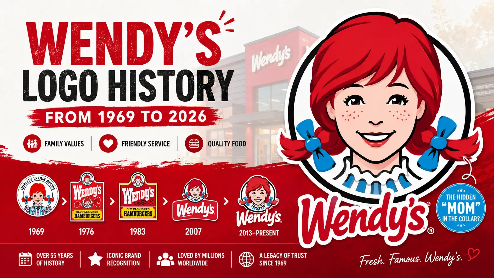
Many people believe there is a hidden word, “MOM,” in Wendys logo. If you look closely at the collar below Wendy’s face, the design appears to spell the word “MOM.”
Some fans think this hidden detail was meant to make customers feel at home and remind them of homemade food. However, Wendy’s has said that the word was not intentionally included in the logo.
Even so, the hidden “MOM” message remains one of the most interesting facts about Wendy’s branding.
Who Is the Girl in the Wendy’s Logo?
The girl in the Wendys logo is Wendy Thomas, the daughter of Wendy’s founder, Dave Thomas. Her real name is Melinda Lou Thomas, but her family nickname was “Wendy.”
When Dave Thomas opened Wendy’s in 1969, he chose his daughter’s image for the brand logo to give the restaurant a friendly, family-oriented identity. Today, Wendy’s smiling red-haired mascot remains one of the most recognizable fast-food logos in the world.
Wendy’s Logo 1969–1971
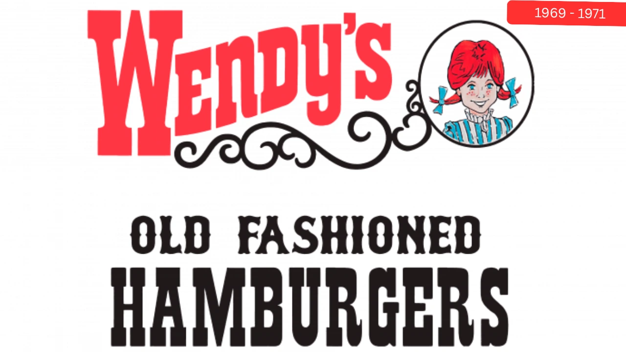
The first Wendy’s logo was introduced in 1969 when the restaurant opened. It featured a smiling red-haired girl, Wendy, inside a circular badge next to the restaurant name.
The design also included the slogan “Old Fashioned Hamburgers” to highlight the brand’s focus on traditional burgers. With its Western-style look and bold red lettering, the logo helped create a friendly and memorable identity for the new fast-food chain.
Wendy’s Logo 1971–1972 Update
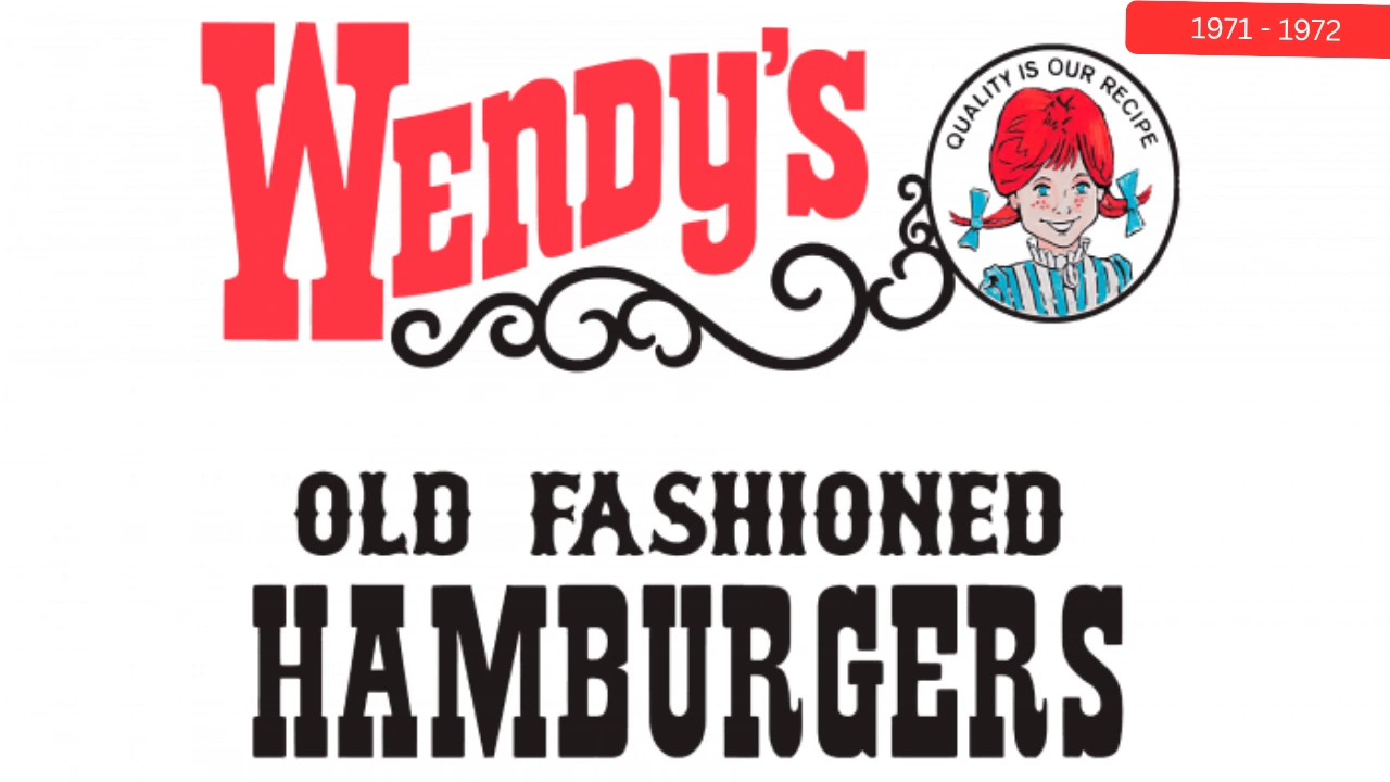
After opening its second restaurant, Wendy’s introduced a refreshed logo to reflect the addition of a drive-up service window for customers. Most of the original design remained unchanged.
The main update was made to the circular portrait of Wendy, where the slogan “Quality Is Our Recipe” was placed in a curved shape above her head, giving the emblem a more distinctive and recognizable appearance.
Wendy’s Logo 1972–1976
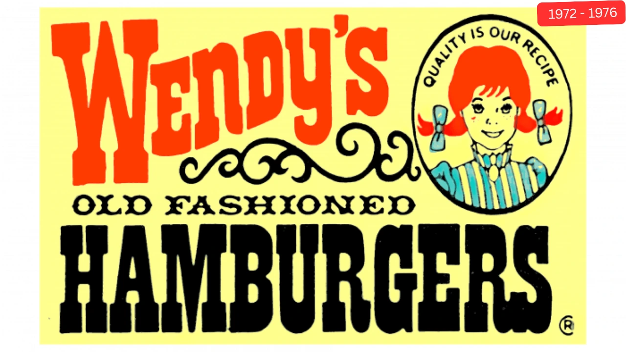
In 1972, For the first time, Wendy’s portrait was redesigned to give the founder’s daughter a more mature and formal look.
The playful expression was toned down, and blue stripes were added to her collar to match her dress. The decorative curls were moved outside the circular frame, while the slogan was updated and the words “Old Fashioned” were shown in a new font at about half their previous size.
Wendy’s Logo 1976–1983
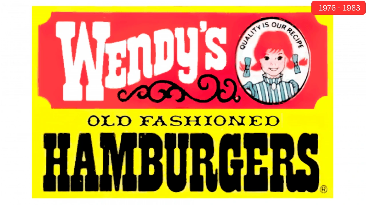
In 1976, Wendy’s gave its logo a brighter and more modern look. The design featured a bold yellow background with the brand name displayed in white letters on a red banner.
Wendy’s classic mascot remained the centerpiece, while the phrase “Old Fashioned” was added to emphasize the restaurant’s traditional burger-making style. This colorful update helped the logo stand out and become more recognizable to customers.
Wendy’s Logo 1983–2013
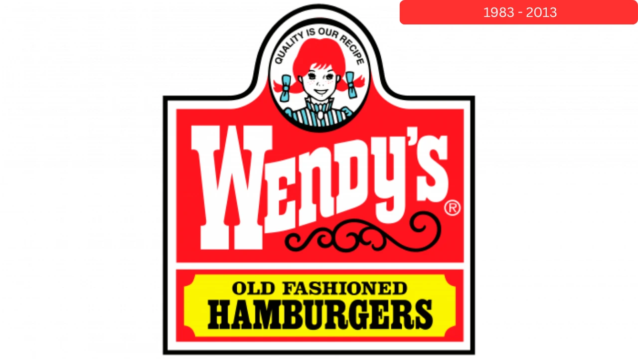
In 1983, Wendy’s introduced a cleaner and more polished logo. Wendy’s smiling face was moved to the top, making it the main focus of the design. Over the years, the logo was refined, and in 1992 the background became mostly red for a stronger and more recognizable look.
The Wendy’s name was enlarged, while the slogan “Old Fashioned Hamburgers” was placed on a yellow banner at the bottom. This version became one of the brand’s most iconic logos and remained in use for nearly 30 years.
Wendy’s Logo 2007–2013
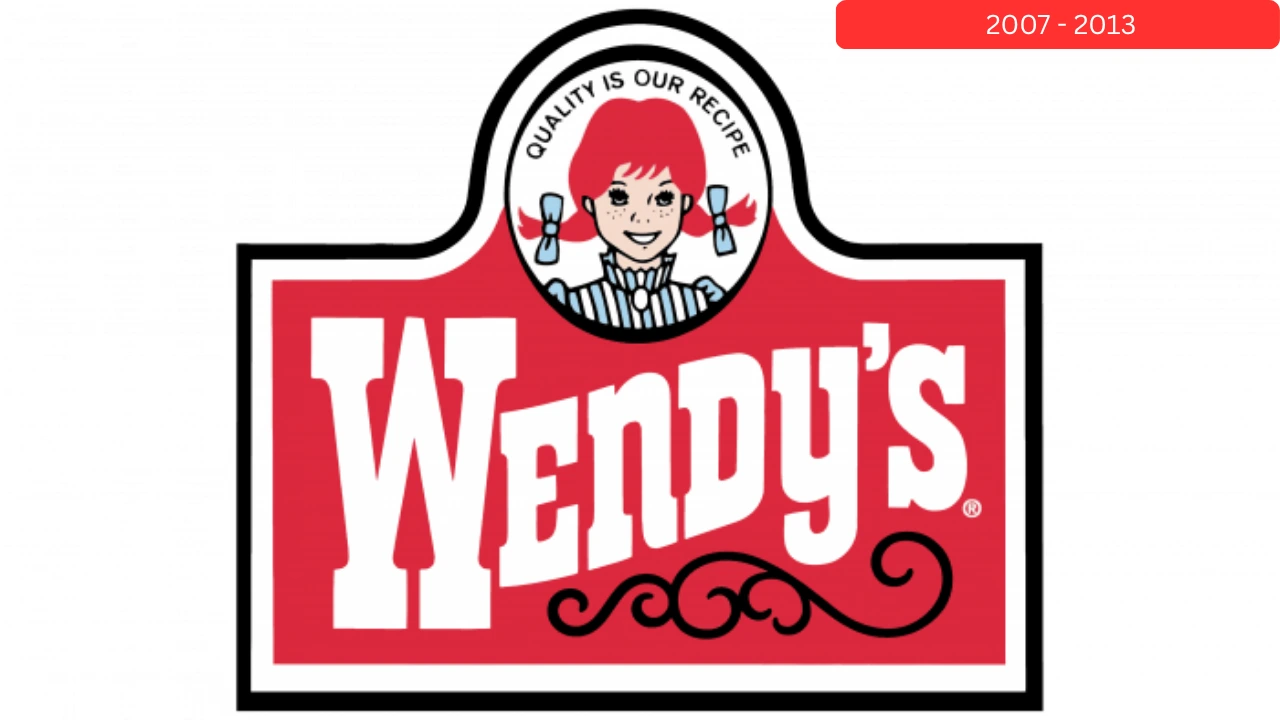
In 2007, Wendy’s simplified its logo to give it a cleaner and more modern appearance. The design featured Wendy’s face above a red banner displaying the brand name, while unnecessary elements were removed for a less cluttered look.
The updated logo maintained Wendy’s traditional identity while making the brand appear more professional, fresh, and easy to recognize.
Wendy’s Logo 2013–Today
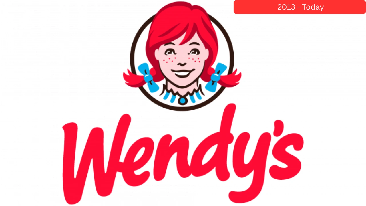
In 2013, Wendy’s introduced a completely redesigned logo with a cleaner and more modern look. The updated design kept Wendy’s iconic red-haired portrait and brand name but gave both a softer and friendlier style.
The new lettering became smoother and more welcoming, while Wendy’s hair extended beyond the circular frame, adding a fresh and playful touch. This logo reflects Wendy’s modern image while staying true to its family-friendly roots.
Current Wendy’s Logo Font
The current Wendys logo uses a modern handwritten-style font introduced in 2013. It replaced the older serif lettering that had been part of the brand since 1969. The new script gives the logo a friendlier, more personal, and welcoming appearance.
Current Wendy’s Logo Colors
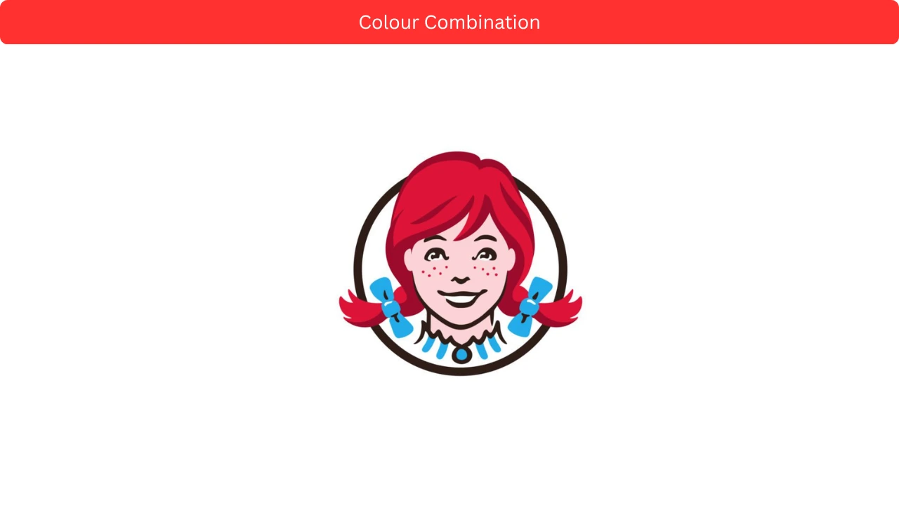
Wendy’s logo features a combination of red, light blue, black, and white. The bright red grabs attention, while the blue and black add balance and contrast. Together, these colors create a clean, cheerful, and easily recognizable brand identity.
Old Wendy’s Logo vs New Wendy’s Logo
Many fans still compare the classic Wendys logo with the modern version. Both logos represent the same brand, but they create very different impressions.
|
Feature |
Old Logo (1983–2013) |
New Logo (2013–Present) |
|
Style |
Traditional |
Modern |
|
Typography |
Bold and formal |
Handwritten |
|
Frame |
Detailed |
Simplified |
|
Wendy Portrait |
Smaller |
Larger |
|
Digital Use |
Limited |
Excellent |
Why Wendy’s Changed Its Logo in 2013
By 2013, Wendy’s wanted to refresh its image and attract a new generation of customers.
The old logo had been used for nearly 30 years and was beginning to look outdated compared to modern restaurant brands.
Read Also: Wendy’s Customer Service Number & Email 2026
Wendy’s Logo Colors Explained
The Wendys logo uses three main colors: red, blue, and white. These colors have been part of the brand for many years and help make the logo easy to recognize.
|
Color |
Meaning |
|
Red |
Energy, excitement, appetite |
|
Blue |
Trust, reliability |
|
White |
Simplicity, cleanliness |
FAQs
What does the Wendy’s logo represent?
The Wendys logo represents a friendly, welcoming brand identity built around simple, honest food. It reflects values like warmth, trust, and a family-style dining experience. The design is meant to feel personal rather than corporate.
Who is the girl in the Wendys logo?
The girl in the logo is Wendy Thomas, the daughter of founder Dave Thomas. She inspired both the name of the restaurant and the mascot. Her image was used to give the brand a real, human connection instead of a fictional character.
Is the Wendys logo based on a real person?
Yes, the logo is directly based on Wendy Thomas. Unlike many fast-food mascots, Wendy is not fictional. She is a real person who became the face of the brand from its early identity and later served as a public representative for the company.
Why do people think there is a hidden “Mom” in the logo?
Many viewers believe the folds in Wendy’s collar form the word “Mom.” This idea became popular online and is often shared as a hidden design trick. However, Wendy’s has stated that the effect is accidental and not part of the original design plan.
Is the “Mom” hidden message confirmed by Wendy’s?
No. The company has officially denied that any hidden message was intentionally placed in the logo. Designers and branding experts also consider it a visual coincidence created by the shape of the collar.
When was the current Wendy’s logo introduced?
The current version of the Wendys logo was introduced in 2013. This update modernized the design, making it cleaner, more digital-friendly, and easier to use across apps, packaging, and advertisements.
What colors are used in the Wendy’s logo?
The logo mainly uses red, blue, and white. Red represents energy and appetite, blue adds trust and stability, and white brings clarity and simplicity. These colors have remained consistent across most redesigns.
What was the first Wendy’s logo like?
The original logo from 1969 showed Wendy with the “Old Fashioned Hamburgers” slogan. It had a more detailed, classic illustration style compared to today’s simpler design.
Why did Wendy’s choose a girl for its mascot?
The mascot is based on the founder’s daughter, Wendy Thomas. The idea was to give the brand a personal, family-oriented identity that felt warm and trustworthy rather than corporate or artificial.
Can the Wendy’s logo be used freely?
No, the Wendys logo is trademarked. It can only be used for informational or educational purposes in most cases. Commercial use requires permission from the company.